Rush
A One-Stop Shop for Rushee Information.
Team Project | 2020 | 2 months
What is Rush?
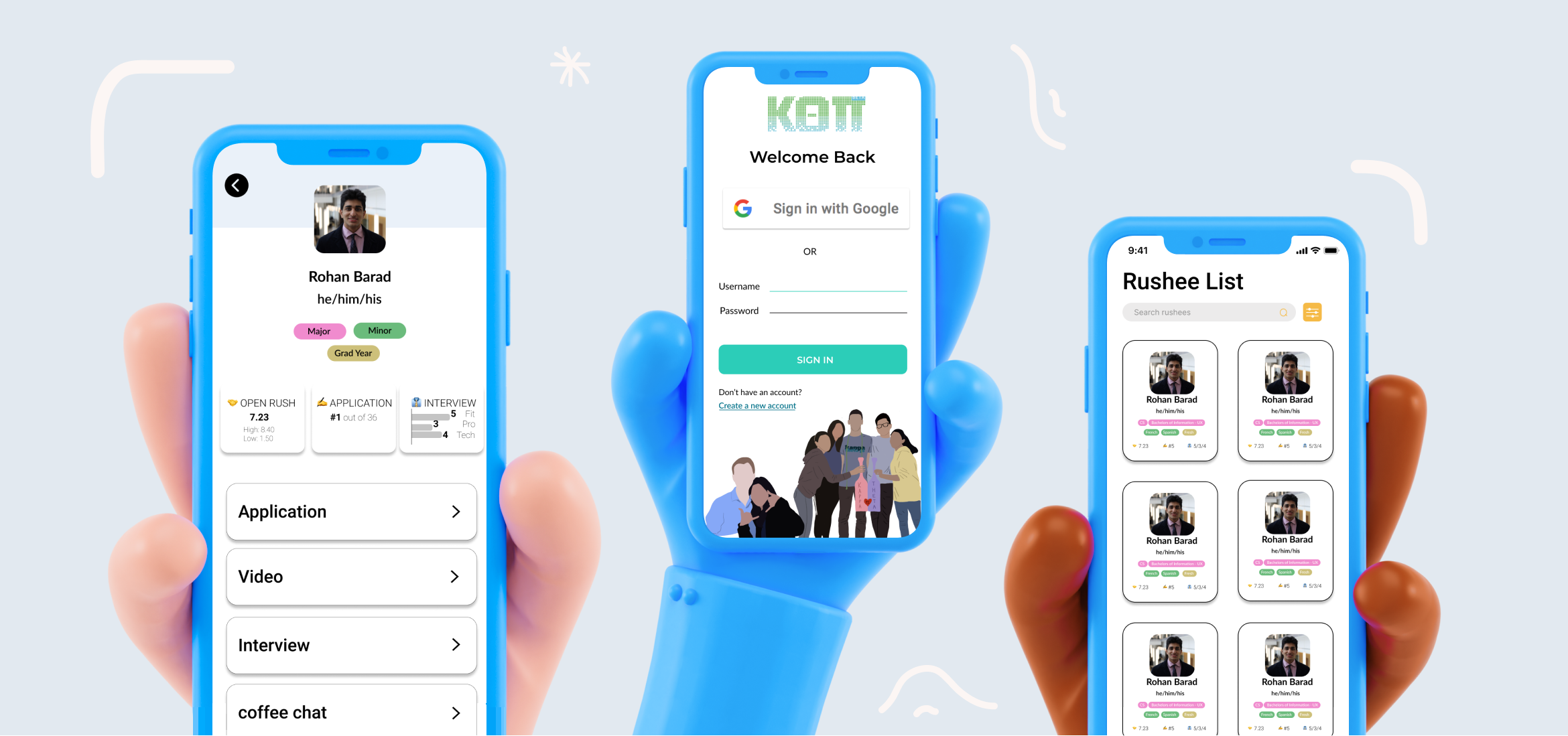
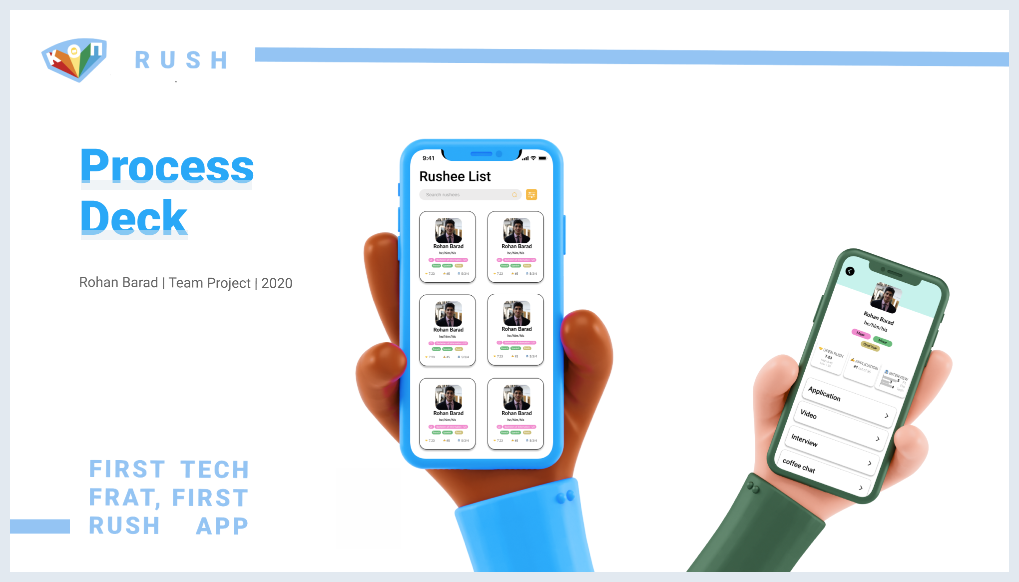
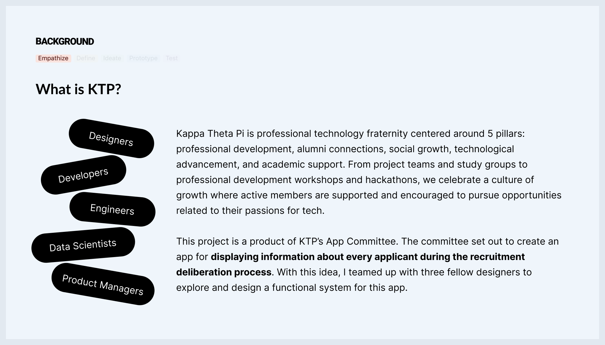
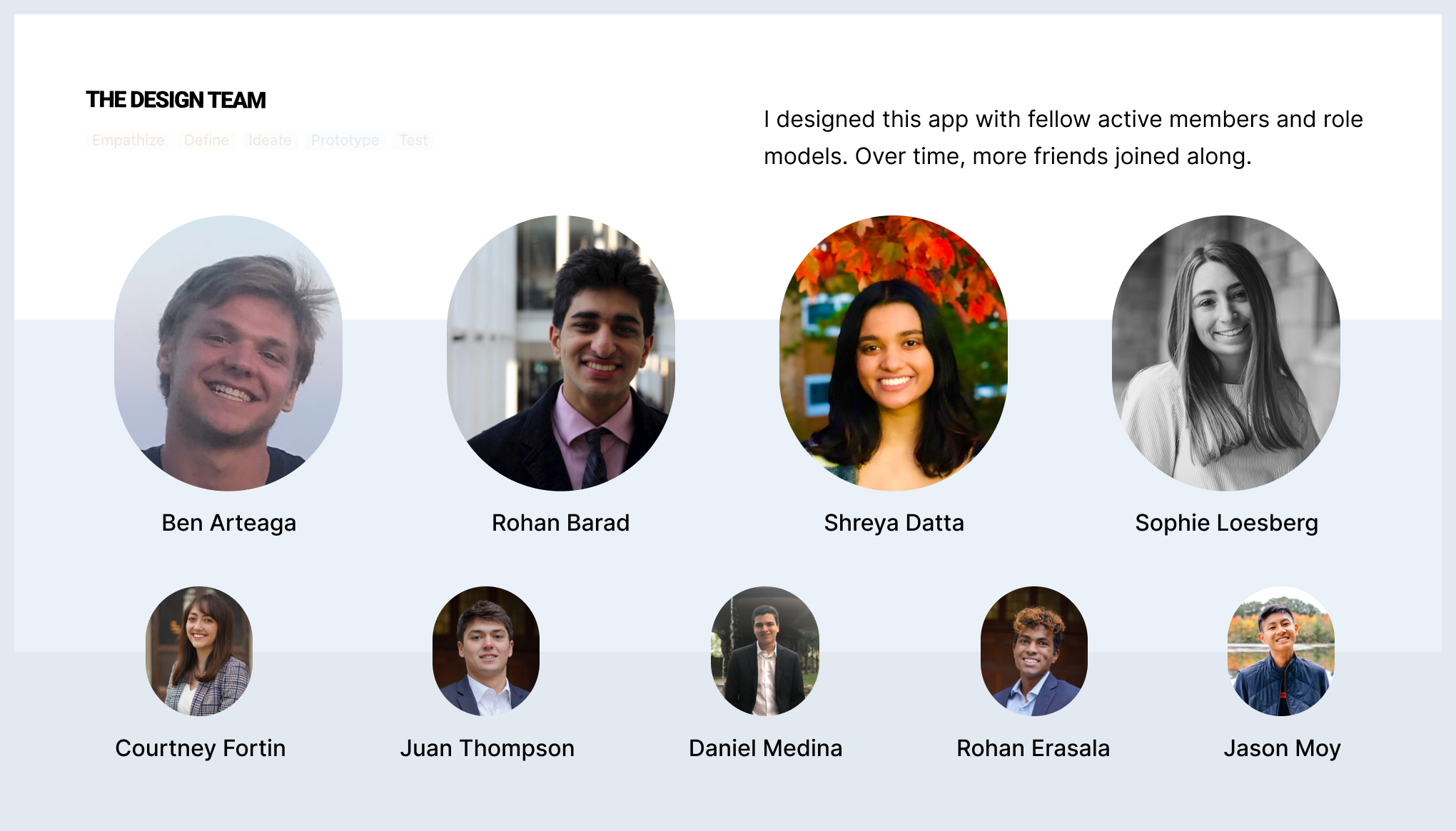
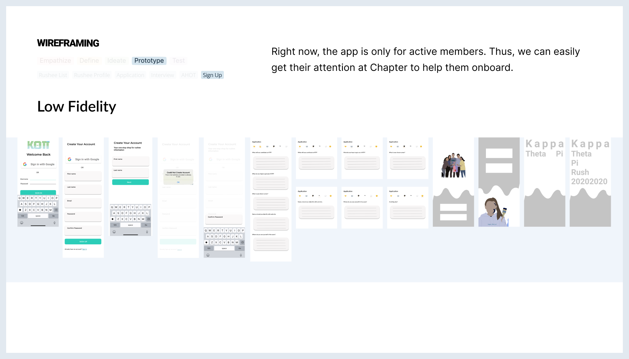
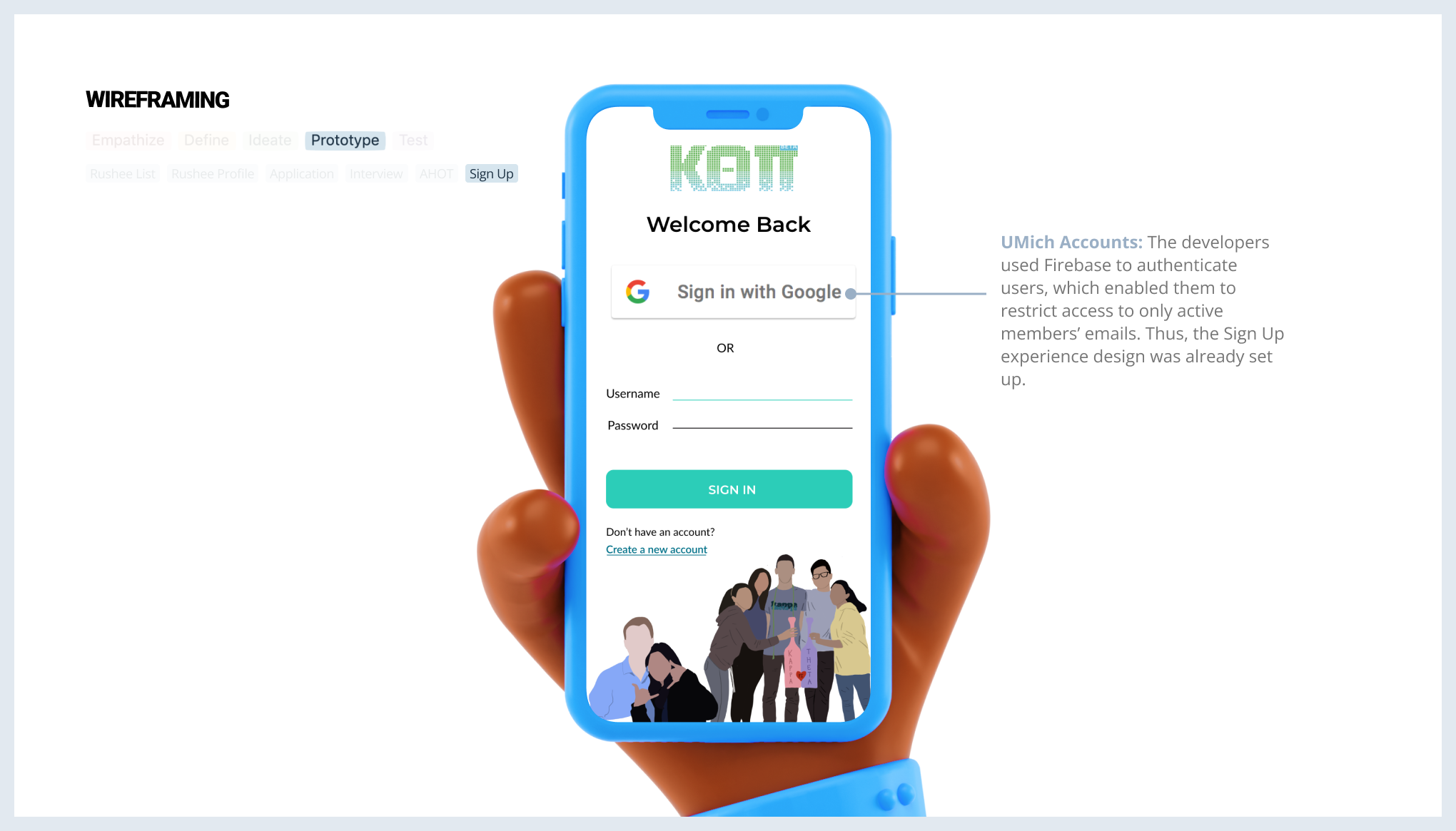
Last winter, my professional technology fraternity wanted to create an app for displaying information about every applicant during the recruitment deliberation process. With this idea, I teamed up with fellow designers to explore and design a functional system for this app. In less than two months, we were tasked with designing screens for the frat's App Committee to develop before Winter Recruitment Season. This culminated in Rush: a one-stop shop for rushee information.
Project Overview
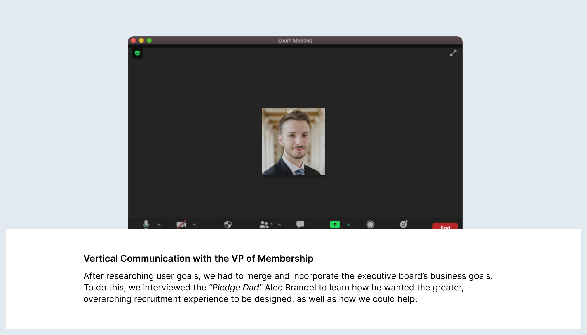
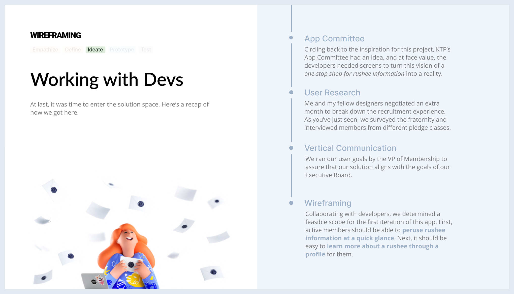
I cherish this experience for many reasons. First, working with developers gave me a better understanding of how to prepare engineering-ready designs. Second, speaking with the Vice President of Membership helped me practice communicating vertically in order to align our solution with the org's greater mission.
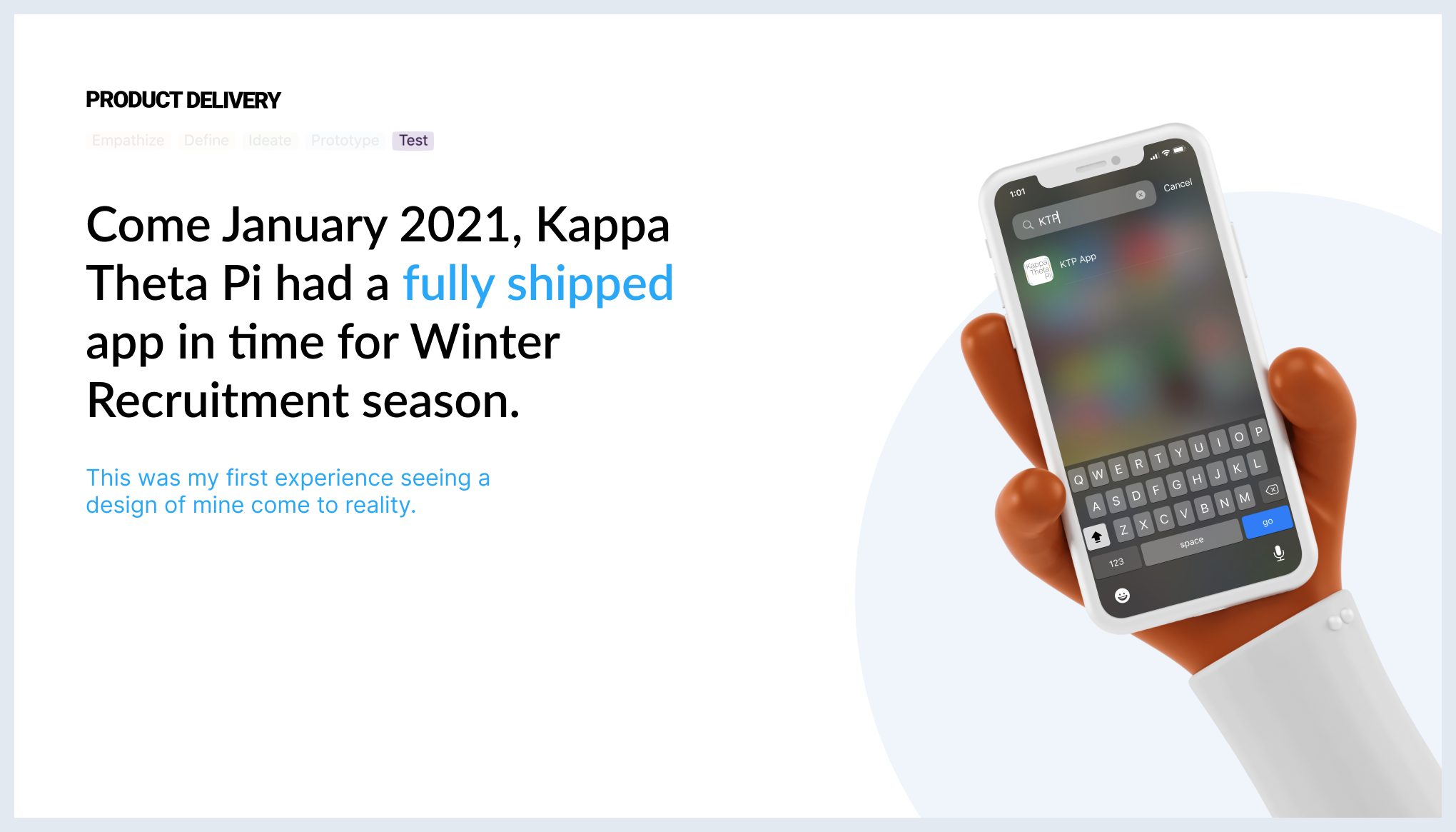
I grew from the design studios with fellow active members and friends, as we shared laughs while critically thinking through different design decisions. Last, but not least, seeing the product get shipped was a delightful experience that I hadn't felt before as a UX Designer.
Role
Product Design
Studio Facilitation
Research Design
Tools
Figma
Miro
UX Methods
Survey
User Interviews
Cross-Functional Collaboration
Wireframing
Problem
Challenge
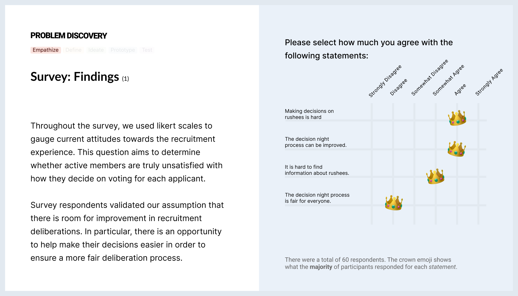
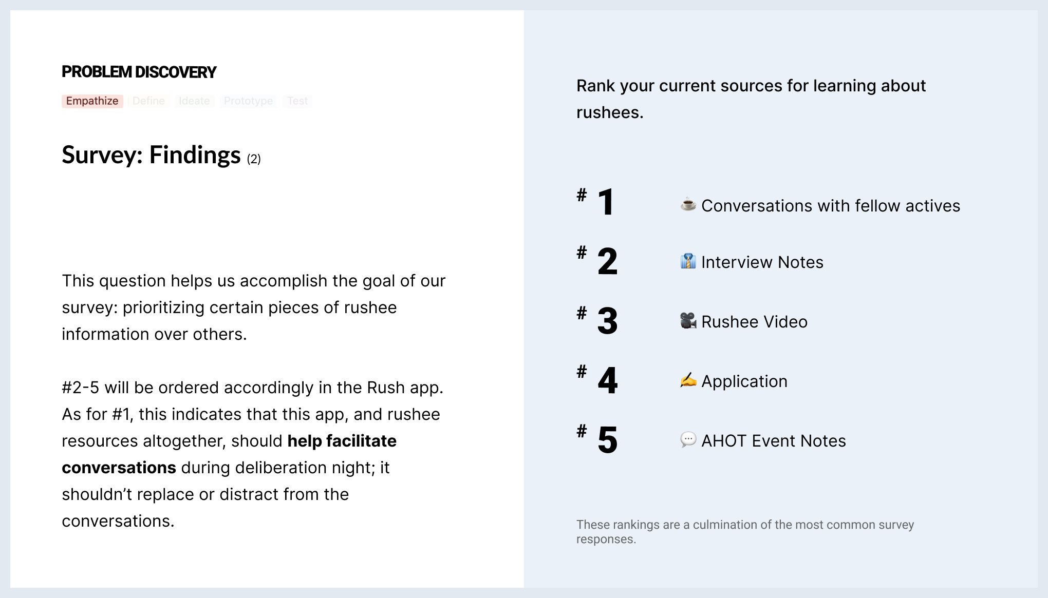
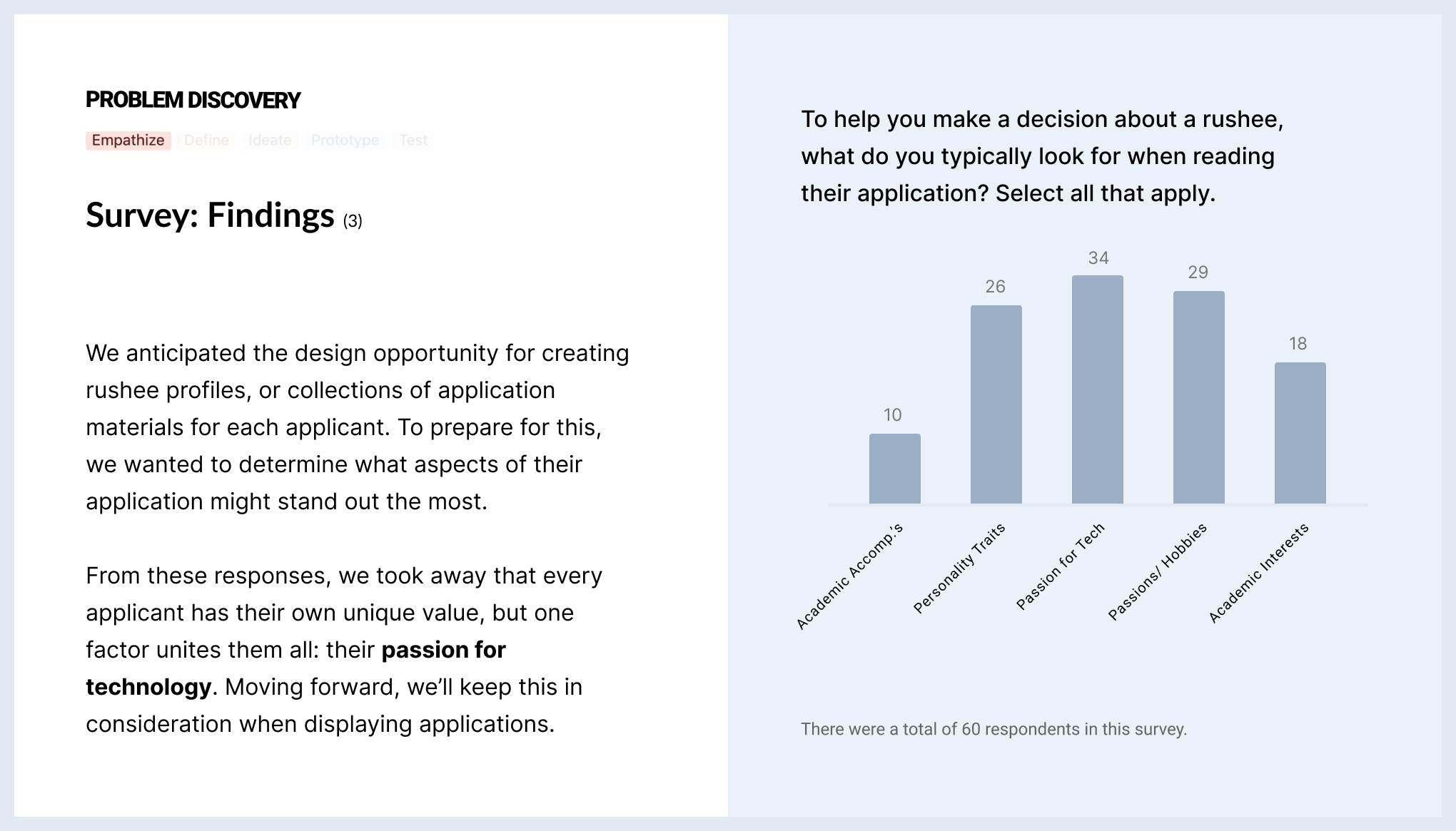
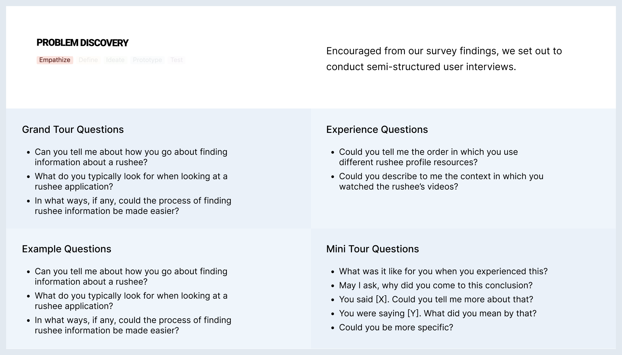
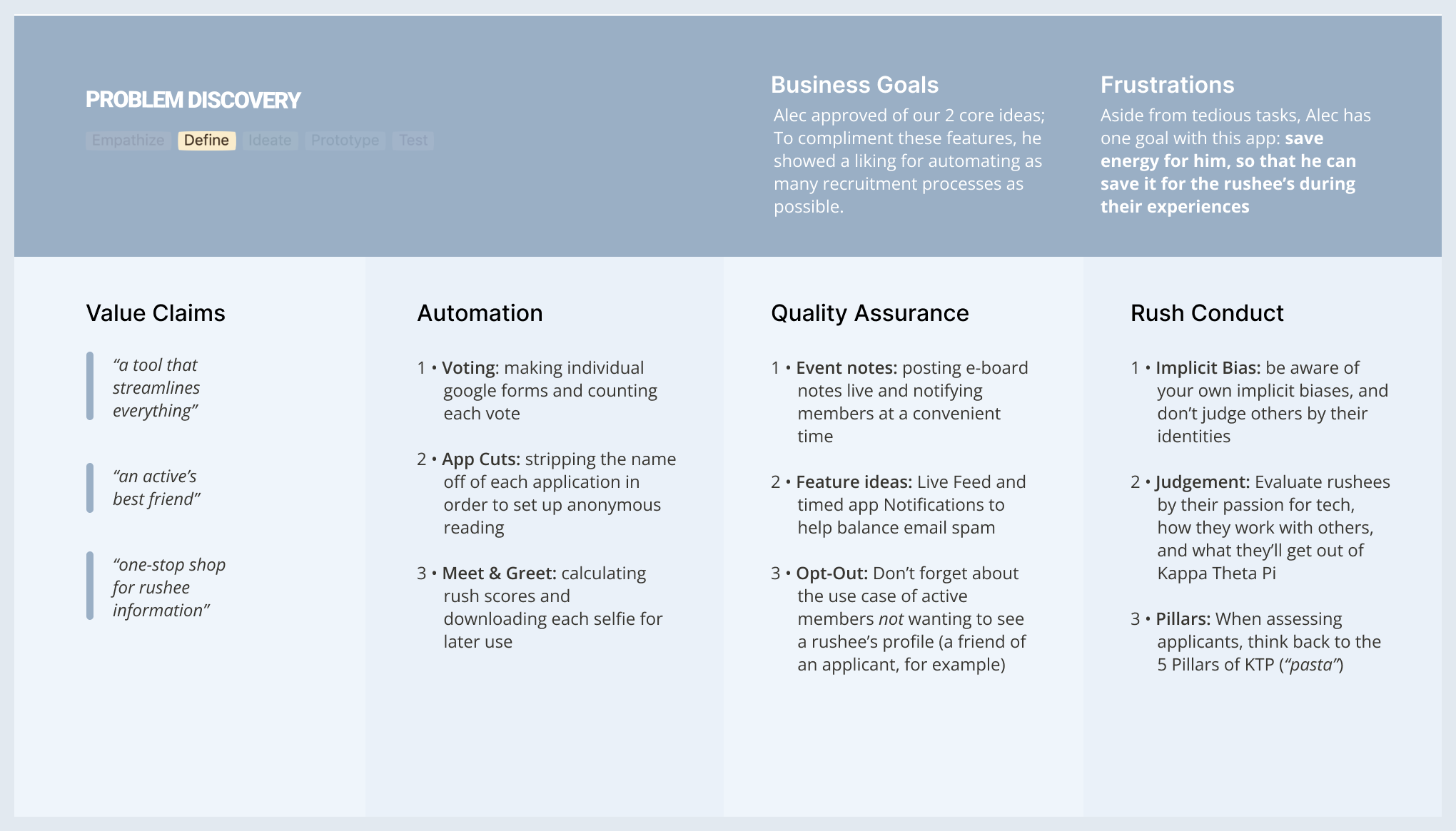
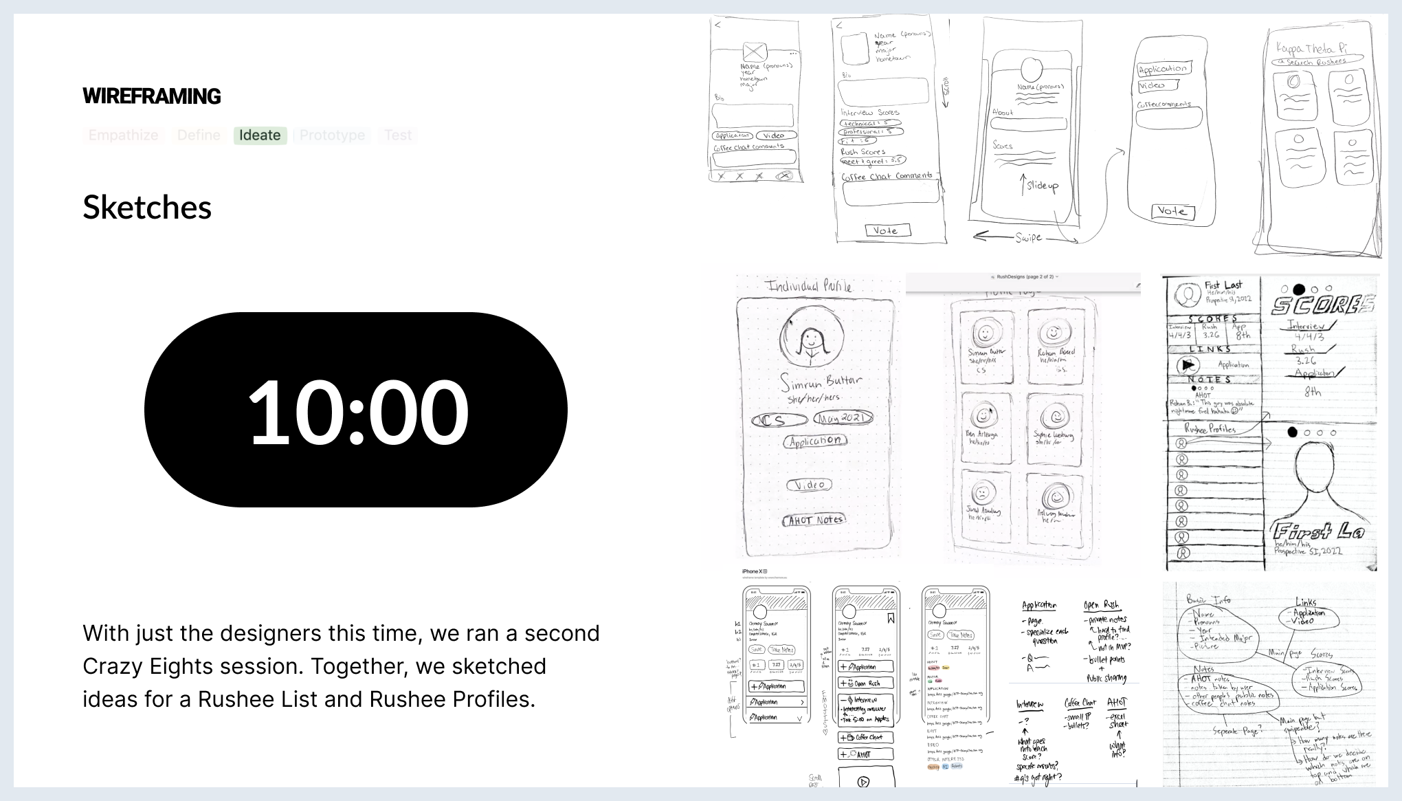
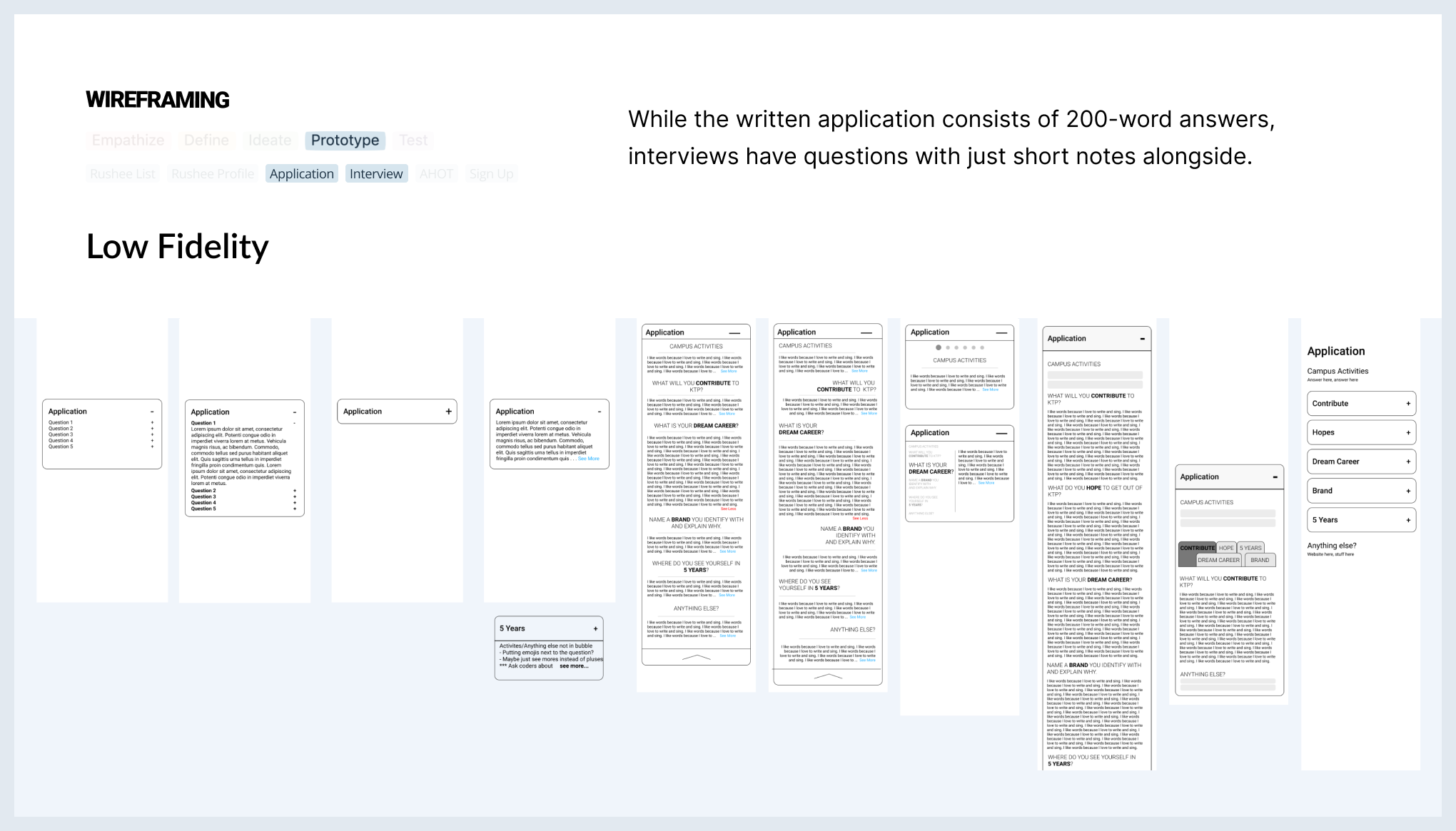
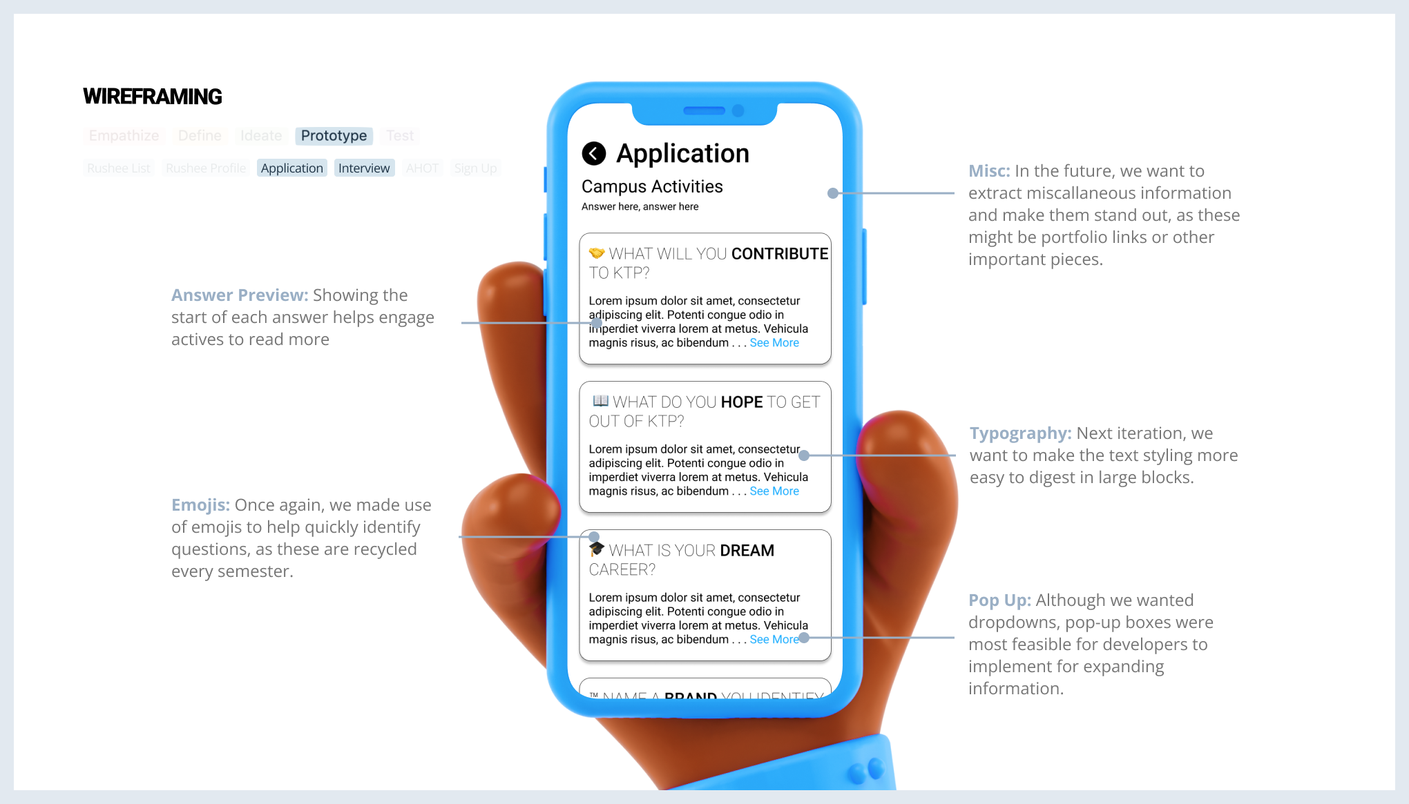
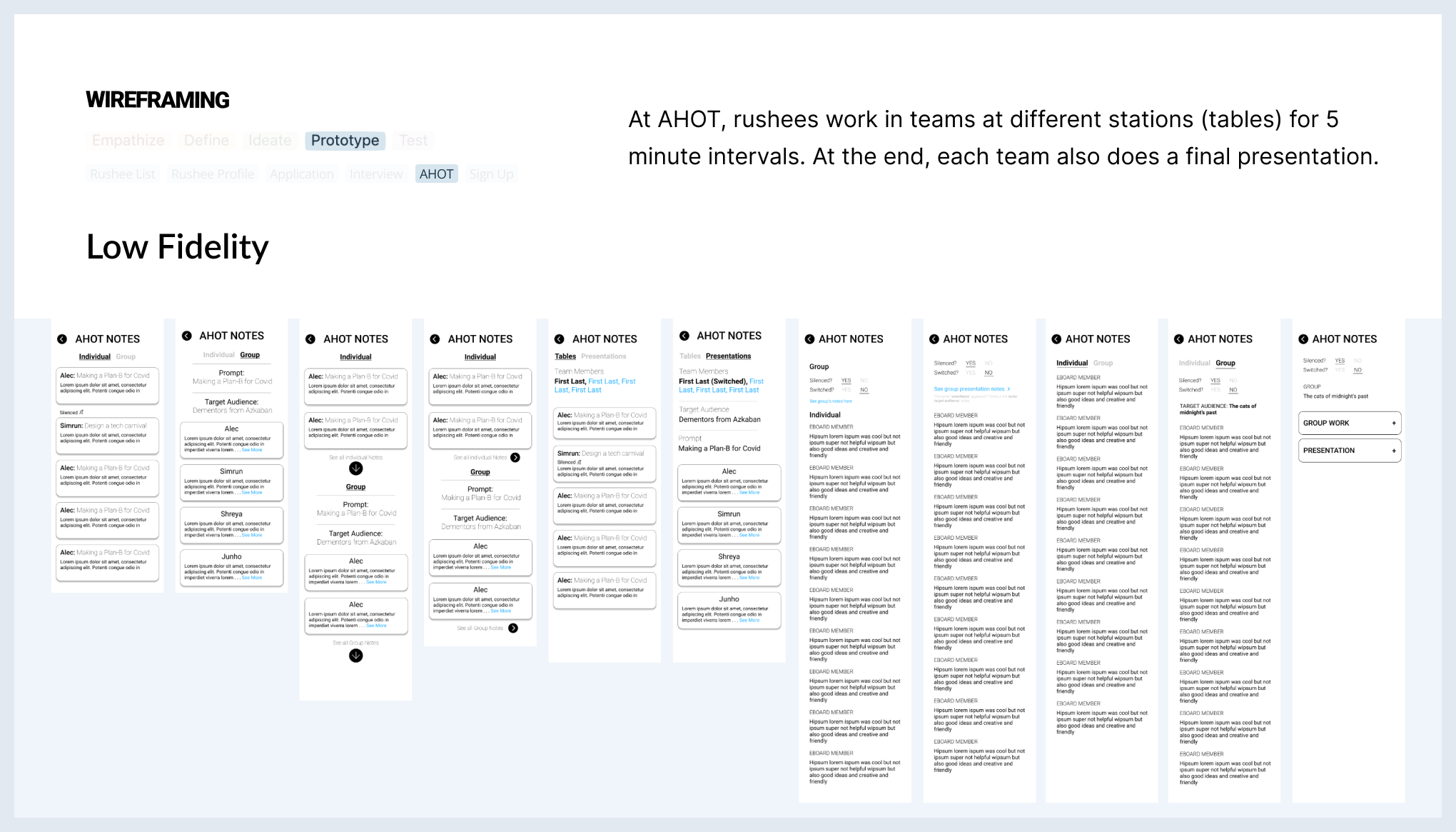
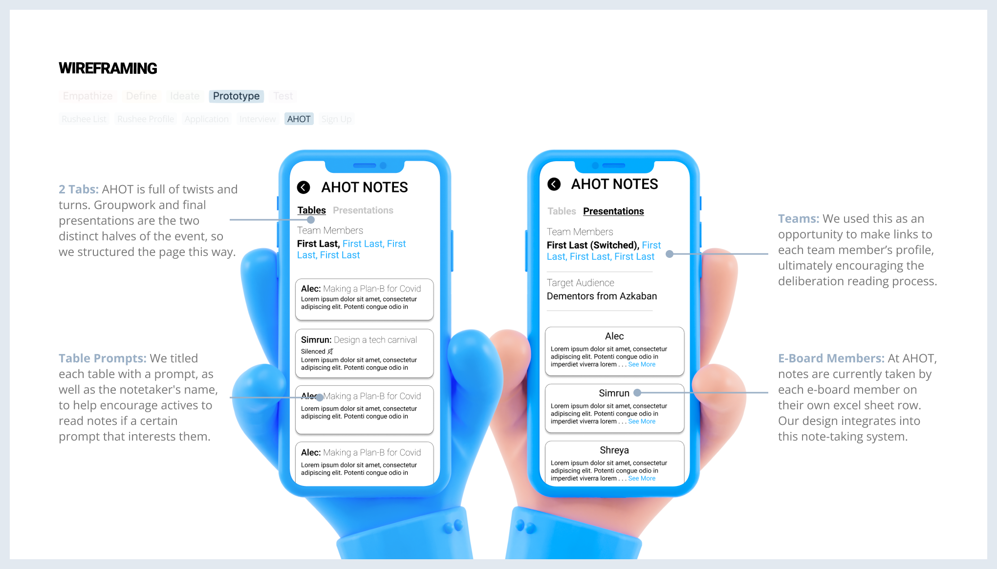
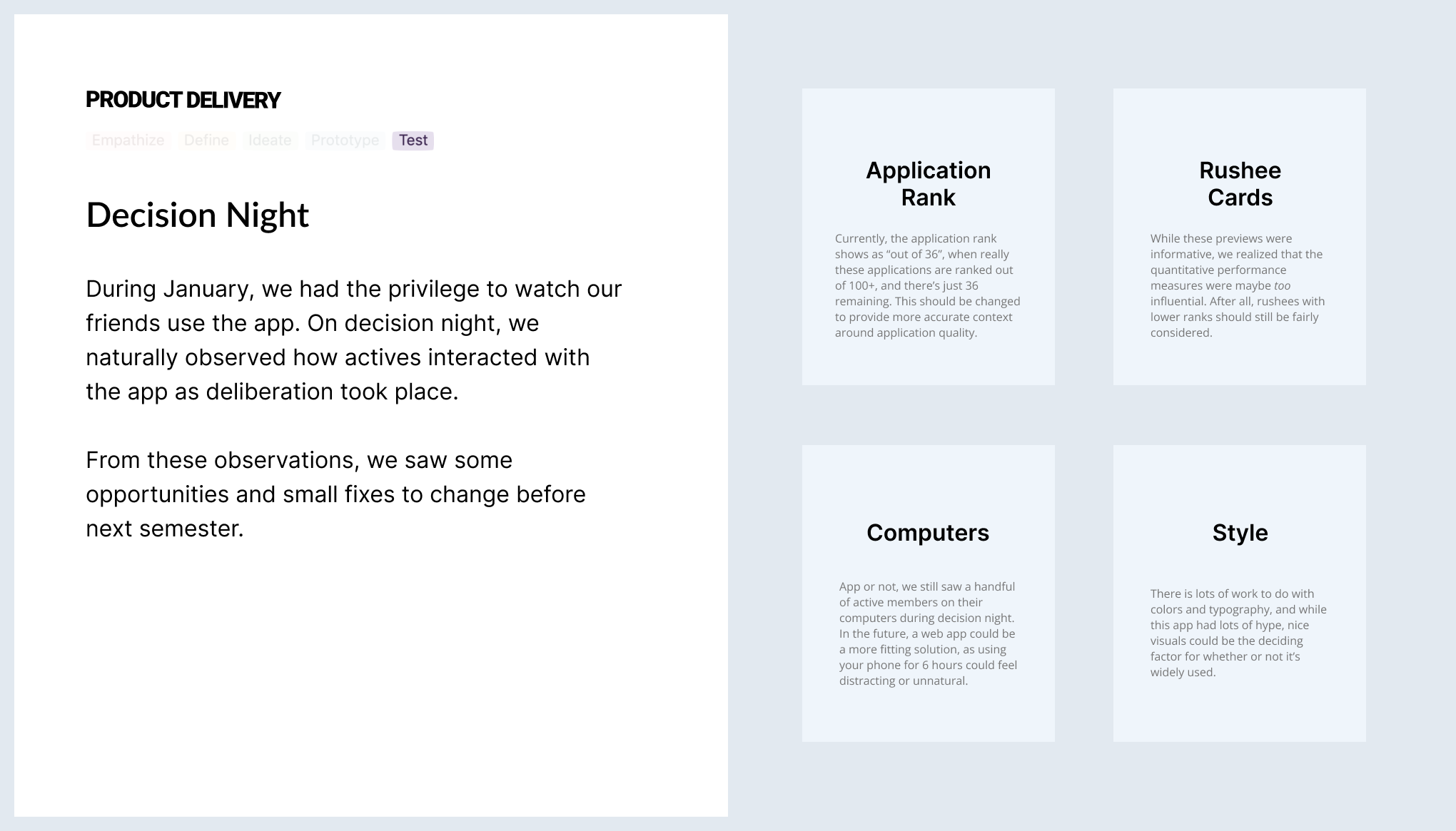
Kappa Theta Pi's recruitment experience includes coffee chats, speed dating, written applications, formal interviews, and more to ultimately consider every applicant, or "rushee", to join the fraternity. From these unique events, there's an overload of personal interactions among 80+ active members and 150+ rushees. To finally decide on selecting new members, KTP has a "decision night" where active members discuss these interactions amongst themselves.
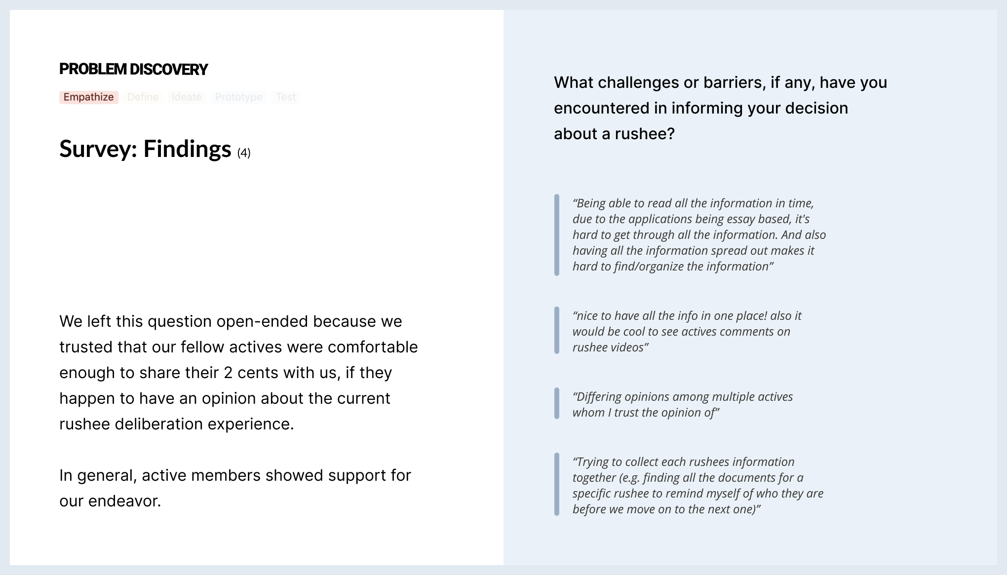
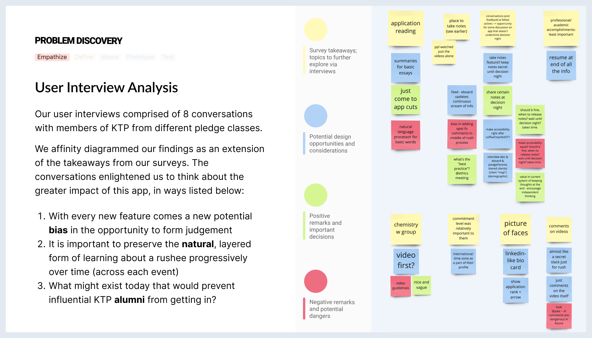
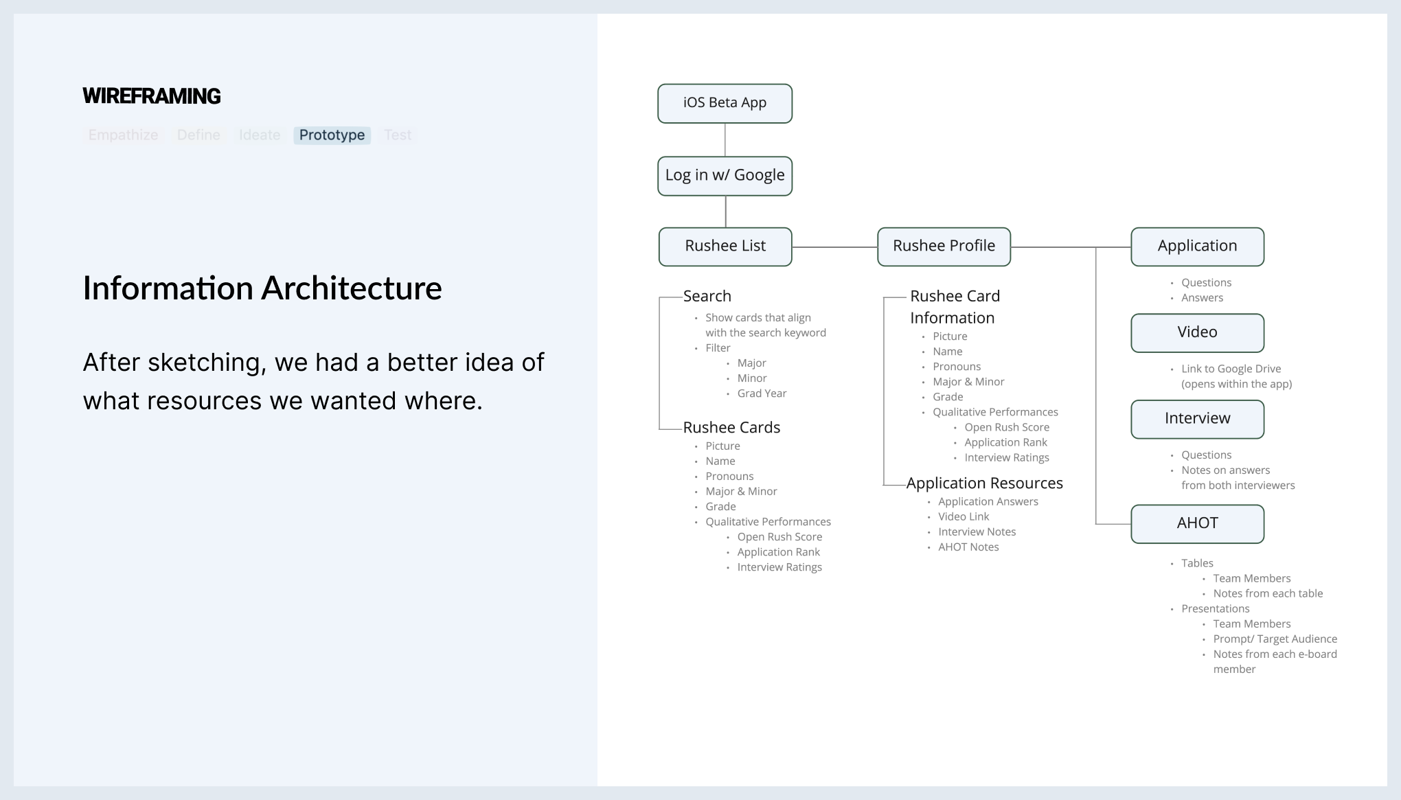
Before each active member makes their decision, they sift through notes about each rushee from the recruitment events; however, these notes display so much information in so many different places. Ultimately, once the vote takes place, actives want to feel informed about a given applicant, while still having enough energy to equally consider the rest of the rushees throughout the night.
Problem Statement
🔍
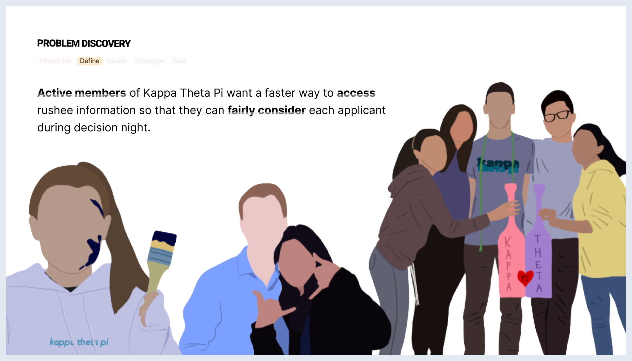
Active members of Kappa Theta Pi want a faster way to access rushee information so that they can fairly consider each applicant during decision night.
The Case
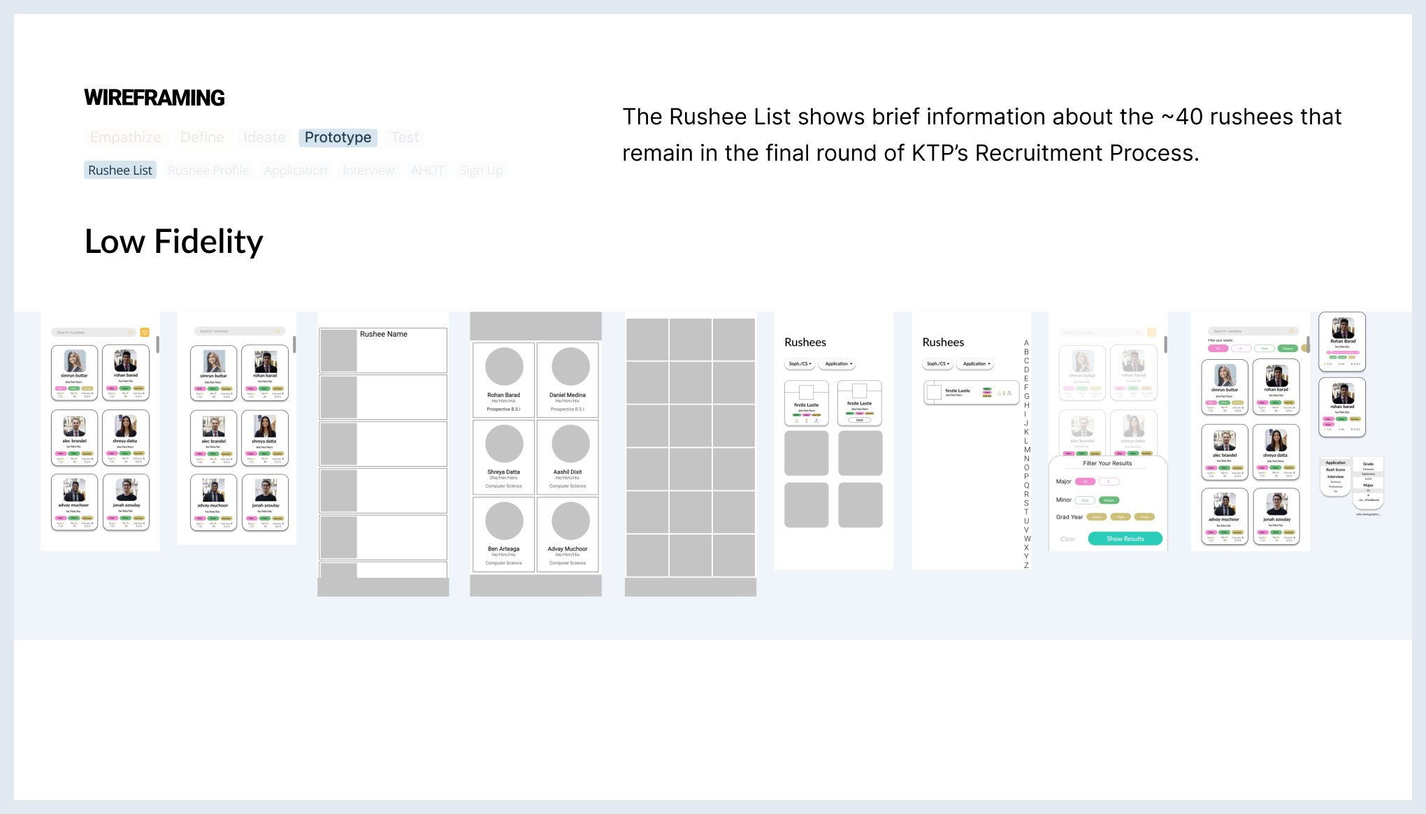
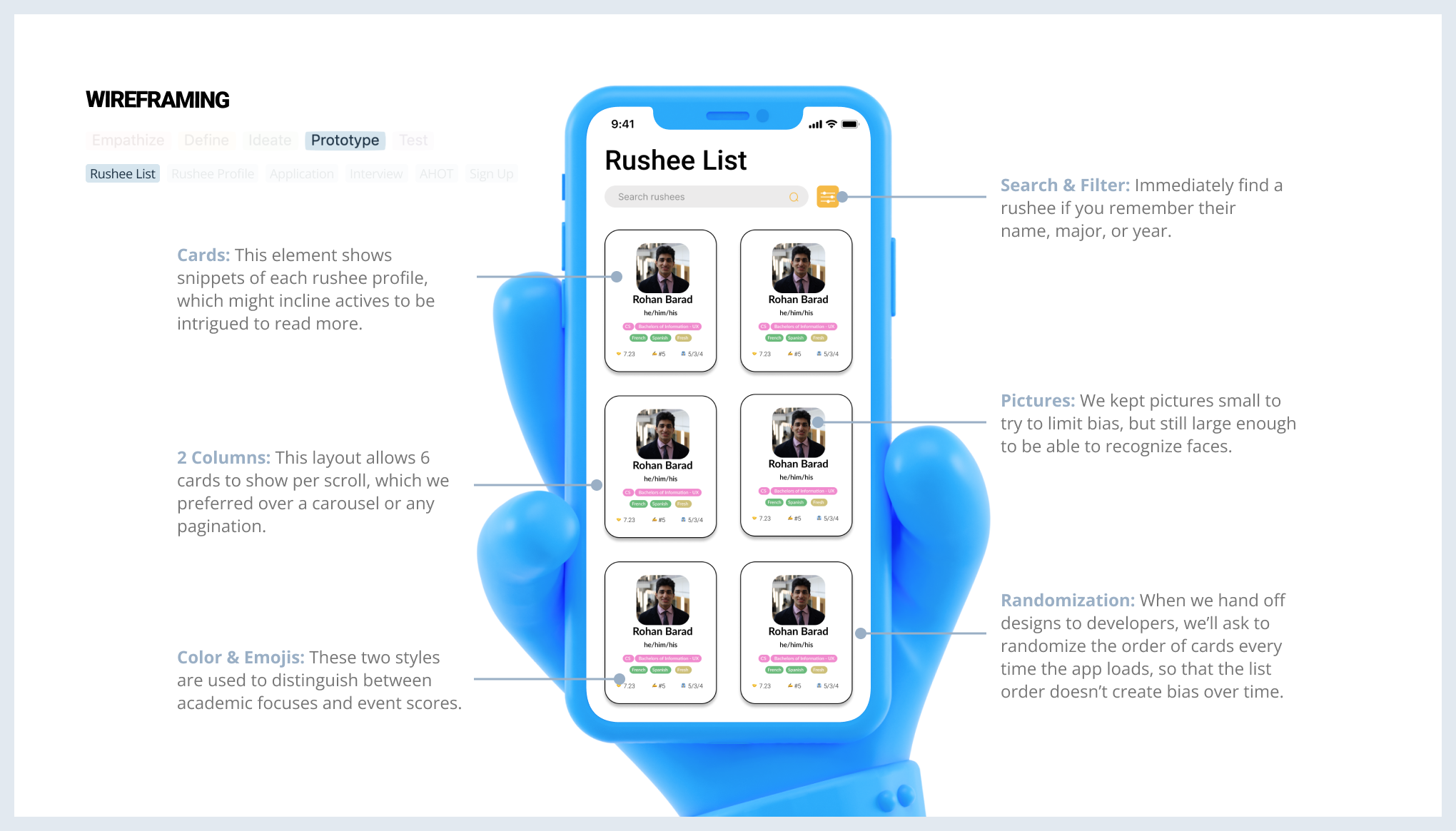
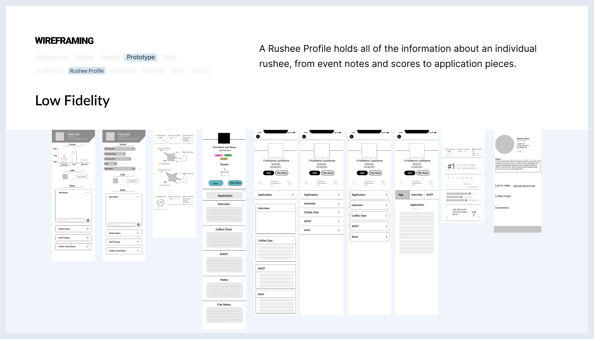
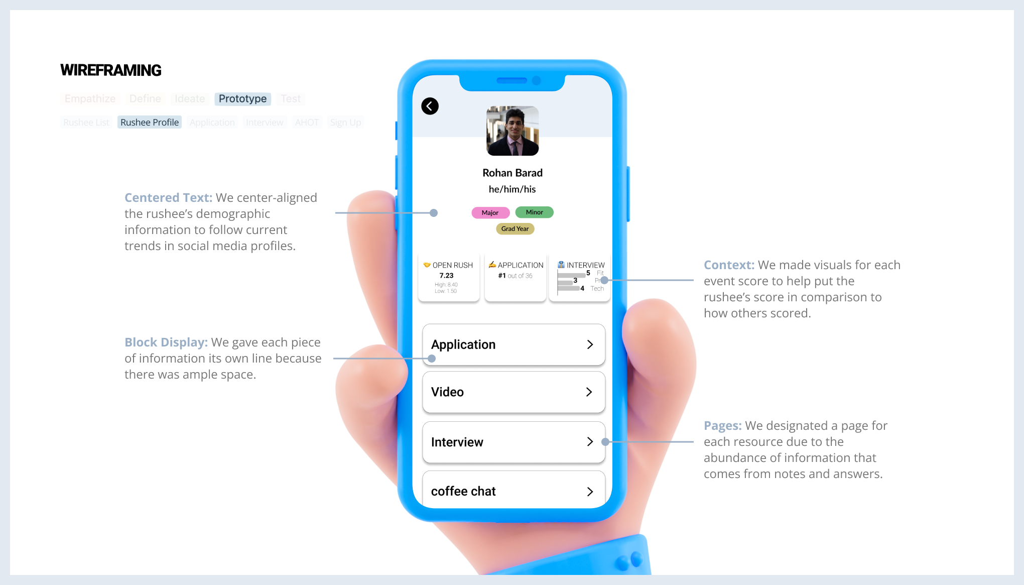
Key Takeaways
Anybody can sketch
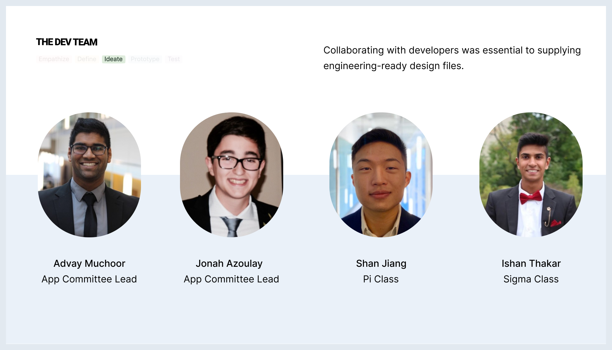
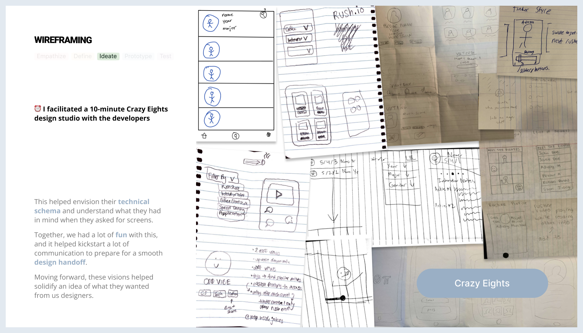
Sketching is a powerful tool. It's quick and easy to do, so it's easy to critique! Most importantly, anybody can do it, from designers to PMs and developers. Thus, it helps the entire team get their ideas out, which helps align their visions with that of designers. Before moving to high fidelity, it's imperative to hash out every perspective of a design decision, which includes business goals and technical feasability. I learned this after facilitating Crazy 8s with the dev team; it was a win-win, as devs thoroughly enjoyed their field trip to paper and pencil, while I gathered insights from their visions about what's feasible.
"Not every problem can be solved by an app"
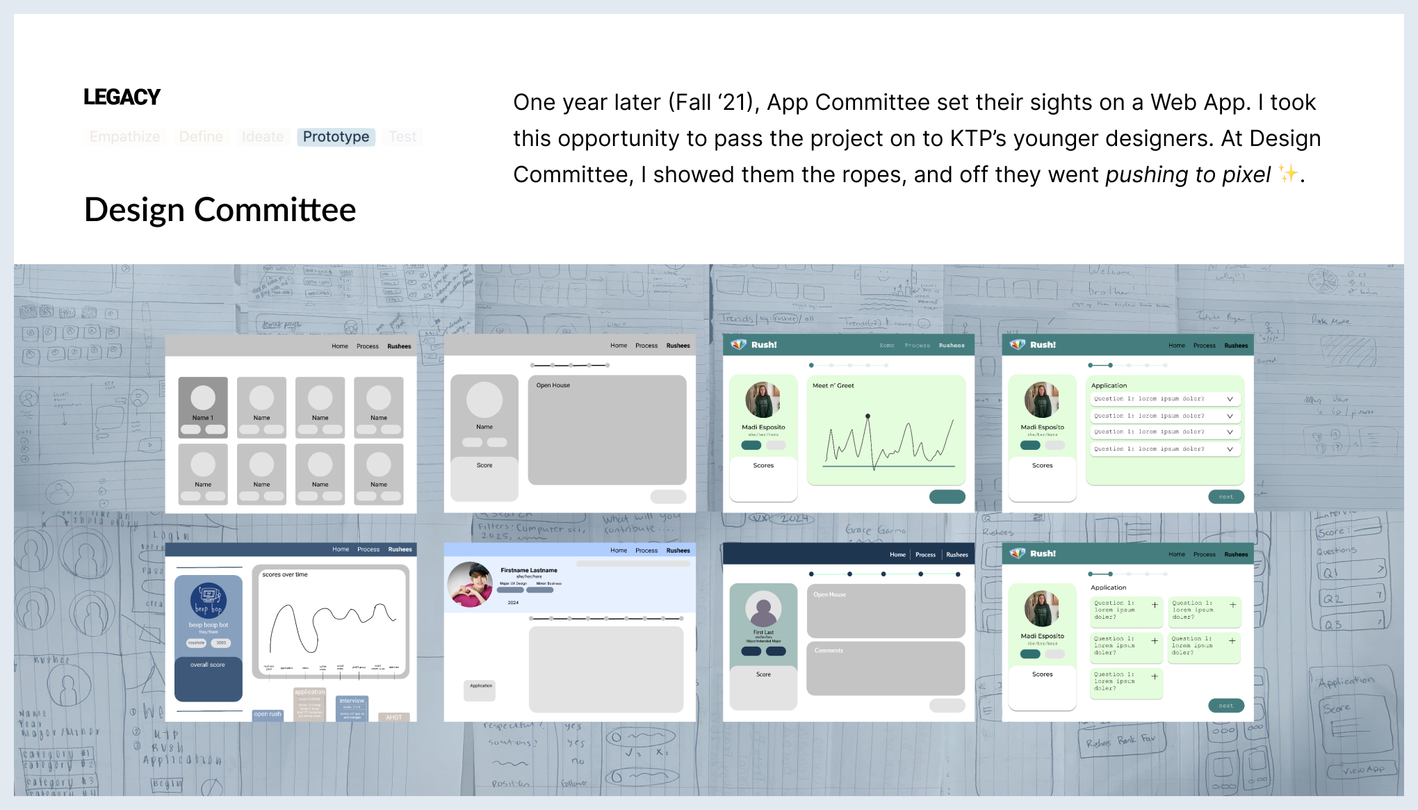
This quote can be directly applied to the legacy of Rush. Our research, ideation, and definitions still stay true; however, when it comes to a solution, making a web-app may be a better fit in the context of rush information. After all, applications and interview notes come in long excerpts, which calls for lots of scrolling on the phone. Nevertheless, the next problem to solve is finding an environment with enough space; active members love having their laptop open during Decision Night, so a web-app is very opportune for spreading out designs and rushee information.
What would I do differently?
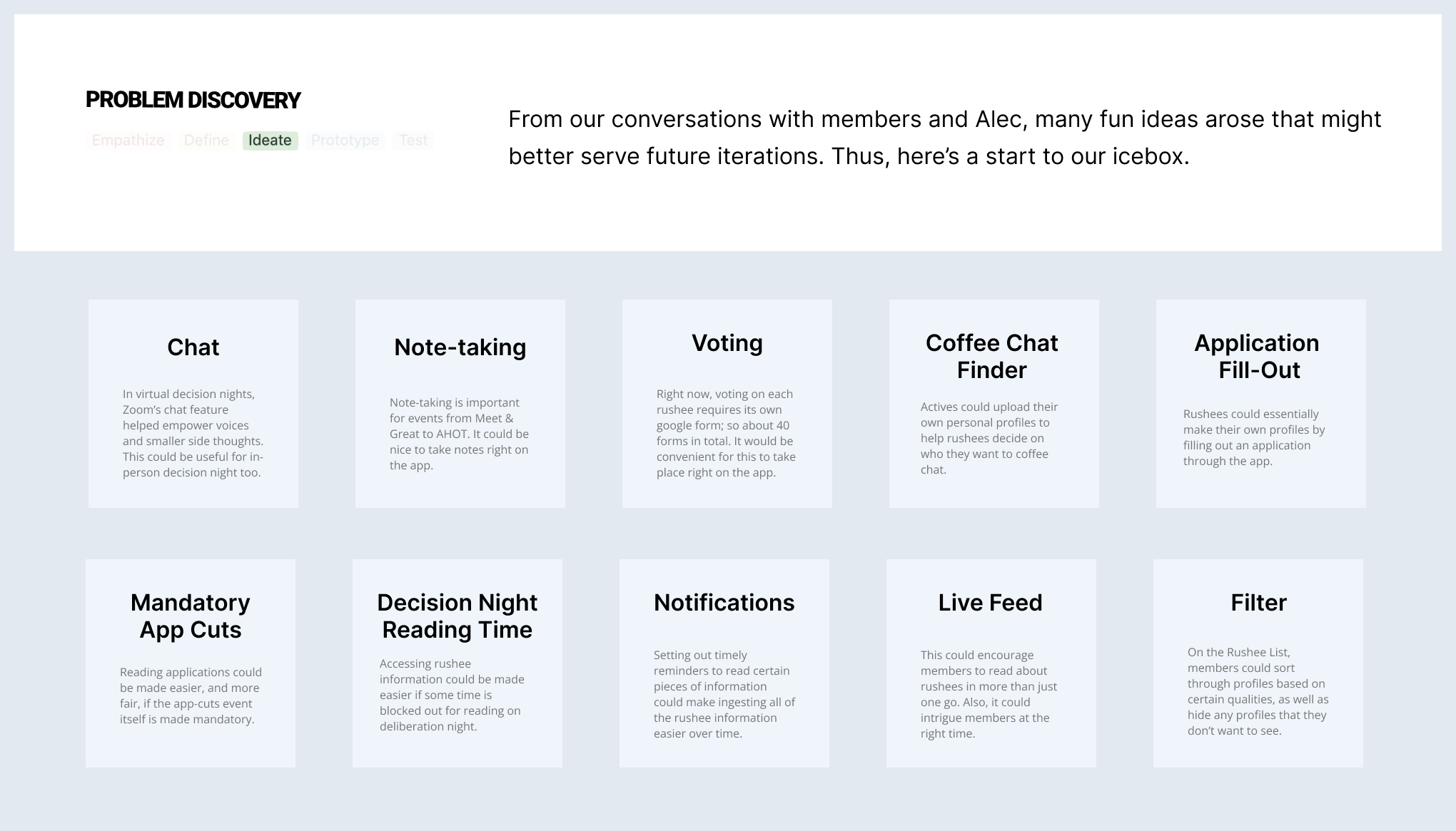
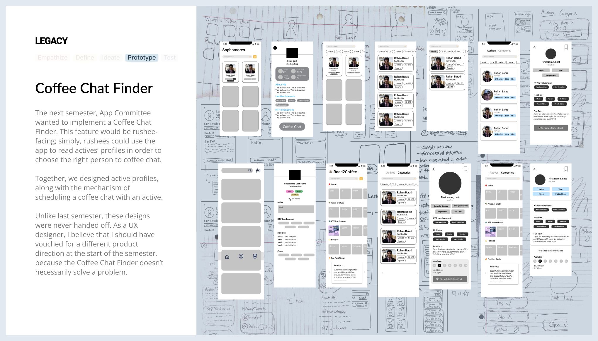
The following semester, we had to choose a new direction for Rush for our second iteration. Following command from the developers, we set out to implementing a Coffee Chat Finder feature; however, rushees were already finding coffee chats with active members without any issues. At this moment, I wish I vouched for a different direction instead of going with the flow. As we designed, that thought lingered in the back of my head, and in the end, the feature never came to fruition. This experience helped me realize the importance of vouching for the user and their problems.
Thank You!
Want s'more? Check out more projects below!


